Advanced Graphing with the Tracker Tool
17 May 2017
Because Dairy farms are paid for pounds of Butterfat and Protein produced, we better be tracking them.
Remember our two things to watch
- Production level- how many lbs of BF and P are being produced?
- Consistency- how much day to day variation is there?
Graphs are great, I use them all the time. One of the drawbacks though is separating day to day variation from actual changes. With this in mind, I’ve been using performance graphs for the past few months. Below is an example tracking lbs of BF produced.
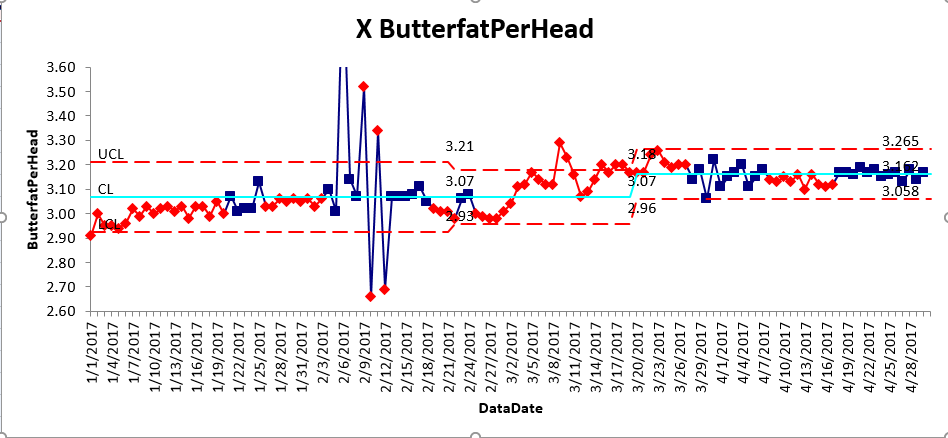
The graph is pretty straight forward- the light blue line is the average, upper and lower red dashed lines are upper control limit and lower control limit respectively. Average, UCL and LCL are calculated based on your numbers. Pretty simple - if the data point is red, something changed. As long as its blue, things are good.
These graphs are not on the website yet. We have a simple excel spreadsheet with an API to pull everything out of our database. It’s easy to update, and still save all your previous work. If you'd like to learn how to use this yourself, let me know.
At Dairy Margin Tracker, not only do we make it easy to track what matters, we make it easy to spot changes.
If you want more information don’t hesitate to call.
Thanks,
Kelly
[email protected]
517.605.7278